


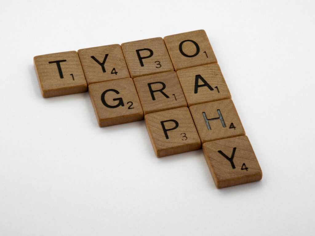
Your website visitors form an opinion about your business within seconds. Before they read your headline or explore your services, they’re already forming impressions based on your design. One of the biggest influences on that first impression is your typography.
The fonts you choose do much more than make your website look attractive. They communicate your brand personality, build trust, improve readability, and guide visitors through your content. Choosing the right fonts for your brand helps create a professional online presence that encourages people to stay longer and take action.
Why Typography Matters in Branding
Typography is more than selecting a font. It includes your font choices, sizing, spacing, hierarchy, and consistency across every page of your website.
Strong typography helps your brand feel:
- Professional
- Trustworthy
- Approachable
- Modern
- Memorable
Poor typography can have the opposite effect. Too many fonts, inconsistent styling, or difficult-to-read text can make even an excellent business appear less polished.
When your typography is intentional, it strengthens your entire brand identity and creates a better experience for every visitor.
How to Choose the Right Fonts for Your Brand
Every font tells a story. The goal is to choose fonts that reflect your brand’s personality and connect with your ideal audience.
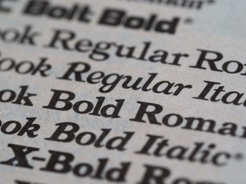
Serif Fonts
Serif fonts include small decorative strokes at the ends of letters. They often communicate:
- Authority
- Tradition
- Luxury
- Credibility
These fonts work well for financial professionals, consultants, attorneys, and premium service brands.
Sans Serif Fonts
Sans serif fonts have clean, simple lines that create a modern and approachable look.
They’re often the best choice for:
- Coaches
- Wellness professionals
- Creative businesses
- Service-based entrepreneurs
Sans serif fonts are also highly readable across desktop and mobile devices, making them an excellent choice for websites.
Script and Display Fonts
Script and display fonts can add personality, but they should be used sparingly.
They’re best suited for:
- Logos
- Headlines
- Small accent text
Avoid using decorative fonts in long paragraphs where readability is the priority.
Keep Your Typography Simple

One of the easiest ways to improve your website is to simplify your typography.
A good starting point is to use:
- One font for headings
- One font for body text
This creates consistency throughout your website while making your content easier to scan.
Popular font pairings include:
- Playfair Display + Lato
- Merriweather + Source Sans 3
- DM Serif Display + Poppins
- Libre Baskerville + Open Sans
Prioritize Readability
Beautiful typography should never come at the expense of readability.
Follow these best practices:
- Use a comfortable body text size.
- Create clear heading hierarchy with H2 and H3 headings.
- Add generous spacing between paragraphs.
- Maintain strong contrast between text and background colors.
- Test readability on both desktop and mobile devices.
When your content is easy to read, visitors are more likely to stay engaged and continue exploring your website.
Common Typography Mistakes to Avoid

Even small typography mistakes can affect how your business is perceived.
Watch out for these common issues:
- Using more than two font families.
- Mixing inconsistent heading styles.
- Making body text too small.
- Using decorative fonts for long sections of text.
- Writing entire paragraphs in capital letters.
- Ignoring mobile readability.
Simple adjustments can make your website feel more polished and easier to navigate.
Typography Builds Trust
Your typography works alongside your colors, imagery, messaging, and layout to create a complete brand experience.
When these elements are consistent, visitors are more likely to trust your business and feel confident taking the next step.
Choosing the right fonts isn’t simply a design decision. It’s a business decision that shapes how people perceive your expertise, professionalism, and attention to detail.
If you’re creating a new website or refreshing your brand, don’t overlook typography. The right font choices can improve readability, strengthen your brand identity, and help turn more visitors into clients.
Ready to create a website that reflects the quality of your business? Mello Design Studio designs strategic brands and conversion-focused websites that help service-based businesses build trust and attract their ideal clients. Book a discovery call to start building a brand that feels as professional as the work you do.
Related Articles
Continue learning with these resources:
- How to Build a Website That Converts Visitors into Clients
- Why Mobile-First Design Is Essential for Your Business Website
- The Role of White Space in Modern Web Design
- How to Choose the Right Colors for Your Brand
Recommended Resources
For more information on typography and accessibility, explore:


View comments
+ Leave a comment