")


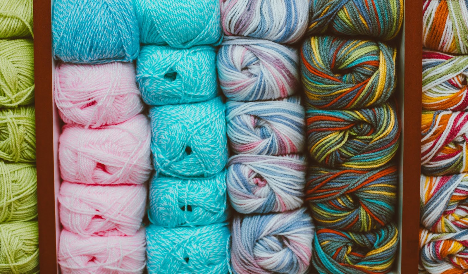
Color isn’t just about aesthetics—it’s a silent language that speaks straight to the brain. Before someone reads your copy, clicks your button, or buys your service, their brain has already reacted to your colors. And that reaction? It can make or break their next move.
In fact, up to 90% of first impressions are influenced by color alone (source). That’s not just interesting—it’s a call to action for anyone running a business, designing a brand, or trying to influence an audience online.
Let’s unpack how color works on a psychological level and how you can use it intentionally to connect, convert, and stand out.

Why Color Psychology Matters in Branding
Color shapes how we feel. And how we feel often decides what we click, buy, or believe.
Brands use color as a shortcut to emotion:
- Red is energizing. It creates urgency and grabs attention. That’s why it’s used in clearance sales and fast food.
- Blue builds trust and calm. Think of Facebook or PayPal—companies that need your confidence.
- Green feels natural, healthy, and stable. You’ll see it often with wellness or eco brands.
- Yellow radiates optimism and warmth but should be used carefully—it can also signal caution.
- Purple feels luxurious and spiritual. Ideal for premium or introspective services.
- Black and white offer contrast, clarity, and a sense of sophistication when used intentionally.
Color psychology isn’t about picking your favorite shade. It’s about choosing what your audience needs to feel in order to trust and connect with you.
The Science of Why We Respond to Color
Two psychological effects help explain how color works in marketing:
1. The Mere-Exposure Effect
We tend to like what we see often. Familiarity builds trust. So if your color palette is consistent—across your logo, website, social media, and materials—your audience begins to feel a connection.
2. The Halo Effect
When we associate a brand color with a good feeling, that feeling extends to the brand itself. This is why luxury brands are so careful with their color presentation—first impressions stick.
Even real-world environments back this up. In Japan, certain streets replaced white lights with blue lighting, which helped reduce crime (source). In casinos, red tables led players to stay longer and spend more—a subtle but powerful nudge.
Culture Changes the Meaning of Color
Color isn’t universal. What symbolizes joy in one culture could represent mourning in another.

Here are a few global contrasts to be aware of:
- White is often linked with purity in Western cultures but is used in funerals in parts of Asia.
- Red means passion and danger in the U.S., but is associated with good luck in China.
- Purple signals royalty in the West but can mean death in Brazil or Thailand.
If you’re building a global brand—or working with diverse communities—understanding cultural color meanings is non-negotiable.
Need a visual breakdown? This guide is a great starting point.
How to Choose the Right Brand Colors
Here’s a quick 4-step process you can follow:
- Start with your brand values. What do you want people to feel? Safe? Energized? Empowered? Match those values to emotional color triggers.
- Know your audience. Are they bold or more conservative? Younger or older? Their preferences matter more than yours.
- Keep it simple. Stick to 2–3 main colors and use variations for accents. Too many colors confuse rather than connect.
- Test and track. Run A/B tests on call-to-action buttons, landing pages, or ads. Even small color tweaks can impact conversions.
Tools like Coolors and Adobe Color can help you experiment with palettes before you commit.
Mistakes to Avoid with Color Strategy
Here’s what often goes wrong:
- Choosing based on personal preference instead of strategy.
- Ignoring contrast and accessibility. Make sure your text is easy to read.
- Inconsistency. Using different shades across platforms dilutes your brand recognition.
- No testing. What looks good to you might not perform well. Always check the data.
Remember: your favorite color isn’t always your brand’s best color.
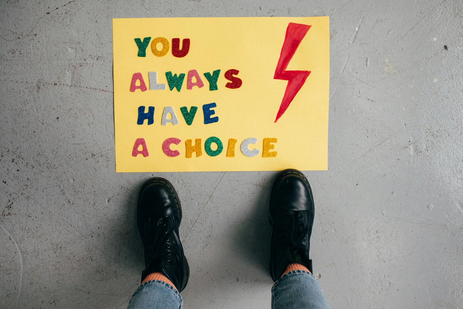
Make Color Work for You
If you’ve made it this far, you already understand one truth—color isn’t random. It’s deliberate. And when used with strategy and empathy, it becomes one of your most powerful brand tools.
So here’s your challenge: Audit your brand colors. Do they match the emotions you want your audience to feel? Are they consistent? Are they helping you convert—or holding you back?
If you want help simplifying your color strategy or crafting a full brand that connects and converts, head over to the Mello Design Studio blog to dive deeper.
Want your audience to feel something the second they land on your site? Start with color.
Let it speak for you—before a single word is read.

")
")

View comments
+ Leave a comment