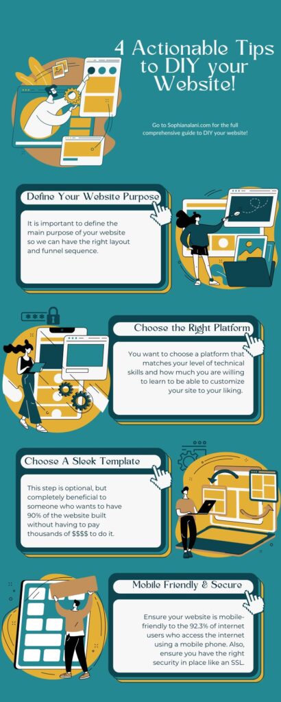
Curious about How to DIY a website on a budget? I’ll walk you through 7 simple steps to create a polished and professional online presence without spending a fortune. Let’s break down the steps:
- Step 1: Define Your Website’s Purpose
- Step 2: Choose the Right Platform
- Step 3: Select a Sleek Template
- Step 4: Customize with Ease
- Step 5: Craft Captivating Content
- Step 6: Essential Pages in a Snap
- Step 7: Mobile-Friendly and Secure
- Step 8: SEO for Small Business Success
Step 1: Define Your Website’s Purpose
Clarity is Key: Ever set out on a journey without a map? Trust me, I’ve been there. Defining your website’s purpose upfront is like charting your course. Start by listing the essential elements you need, such as:
- Photos: Visuals speak volumes. Plan out images that showcase your products, services, or personality.
- Website Copy: Craft written sections like a warm welcome statement, engaging “About Us,” descriptions of your services, powerful testimonies, and a compelling call to action.
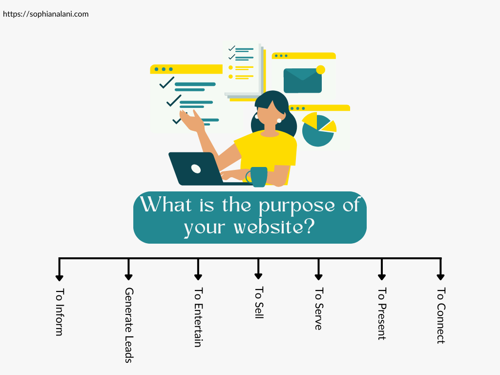
Examples of Different Website Goals based on Your Purpose:
- Building an Email List: Imagine your website as a magnet for potential subscribers. Strategically place sign-up forms to grow your email list and nurture your audience.
- Consultation Calls: Guide visitors towards booking consultation calls directly from your site. Make it easy for them to take that next step.
- Sales: Turn your website into a selling machine. From product descriptions to a seamless checkout process, guide users towards making purchases effortlessly.
Remember, your website’s purpose will shape its design and content, so take your time to clarify your goals before diving in.
Step 2: Choose the Right Platform
Navigating the Tech Maze: It’s like being in a labyrinth, isn’t it? Back when I started, I found myself lost in a sea of options. The good news? You’re not alone, and I’m here to help you navigate.
Some Beginner friendly platforms include:
These offer user-friendly interfaces that make website building a breeze. If you’re unsure where to start, beginner-friendly tutorials are at your disposal. Website builders can be in the ballpark of $20-40 per month depending on the package you need. These website builders also normally provide hosting and occasionally domain purchasing services.
Exploring User-Friendly Website Builders: I have worked with almost all of these companies and I have to say my favorite is Showit. It’s not just your regular drag-and-drop builder – it’s a game-changer. With Showit, you can go beyond basic customization. You have the freedom to pick and choose sections from various websites and tweak them to fit your style. It’s like having a toolbox of creativity at your fingertips.
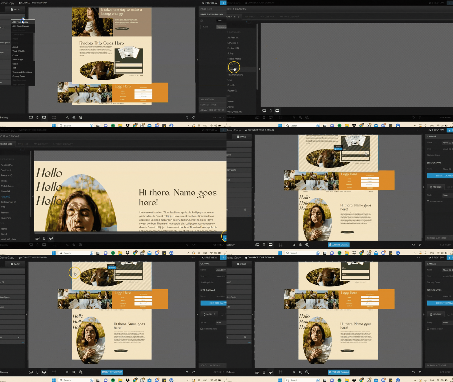
What makes Showit truly shine is its 24/7 support. As a website designer, I’ve seen my fair share of support teams, but Showit is a standout. They’re there when you need them, making the process smoother than ever.
So, whether it’s Showit or another user-friendly platform, your choice sets the stage for your website’s creation. Consider your preferences, the level of customization you desire, and the support you’ll have along the way. Your website’s foundation starts here.
Step 3: Select a Sleek Template
Choosing a website template is an unbeatable method when it comes to DIYing a website on a budget. It saves hours of time and hundreds of dollars by having 90% of the work done for you.
The infamous template selection phase. Been there, done that – and I’ve got some sage advice to share. One thing to remember as you embark on your journey to DIY a website on a budget is not to get too hung up on finding the “perfect” template. Why, you ask? Because the beauty of templates lies in their potential for customization.
Unlocking Customization
Let’s talk about Showit again (yes, it’s that good). Whether you’re opting for Showit or exploring other platforms, templates are like your canvas. You can start with a solid foundation and then sprinkle your personal touch. Don’t worry if you don’t find the exact match for your vision – remember, you have the power to make it uniquely yours.
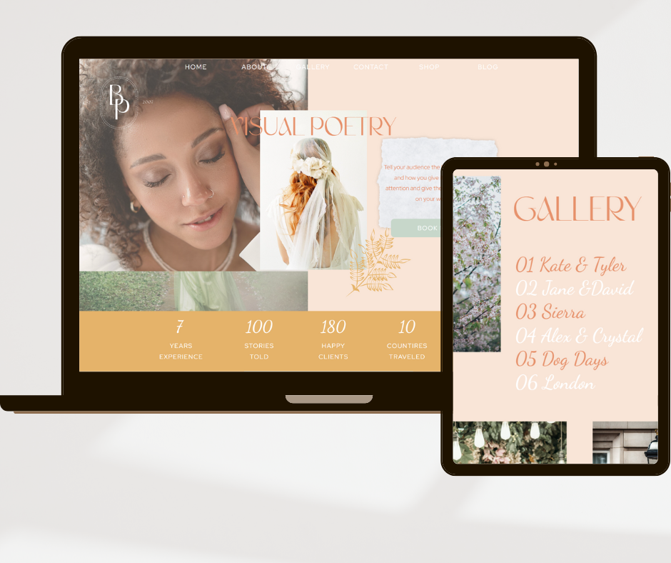
If you’re looking for service-based business templates that align perfectly with the concept of DIY a website on a budget, we’ve got you covered. Check out our collection of templates for sale. They’re designed to save you time and effort while offering a stylish base for your customization. With 90% of the technical work already done, you can effortlessly bring your website to life.
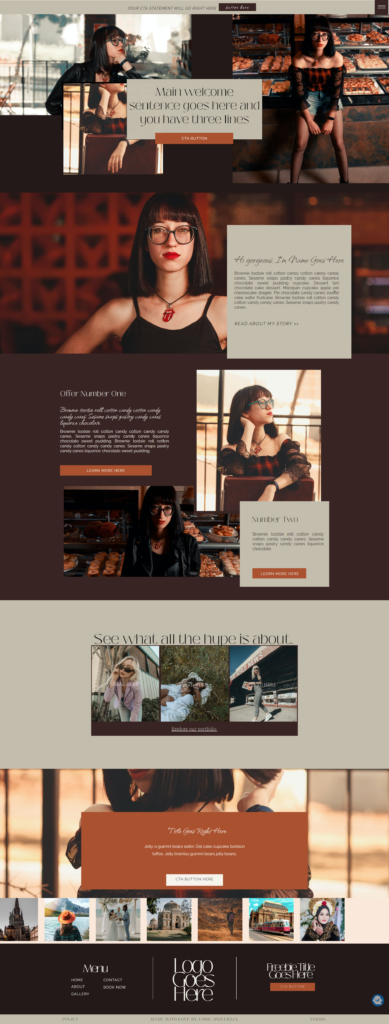
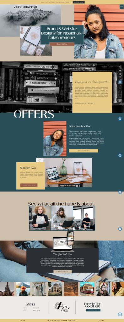
Remember to refer to your list of sections or pages you need based on the goals of your website. Possible extra pages to keep in mind are:
- Sales page
- Photo Gallery
- Booking Page
- Contact Page
- Blog
- Small Sop Pages
Step 4: Customize with Ease
My Color Clashes and Font Fiascos: A Branding Adventure
When it comes to DIY a website on a budget you can often get stuck in designing the perfect branding. Choosing the perfect colors, fonts, mood boards, etc. Learn from my past misadventures to save yourself some headaches.
Choosing Your Colors: Craft a Palette that Speaks Volumes
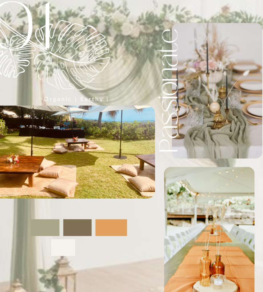
Colors are powerful communicators on your website. Whether you’re aiming for a quick and easy solution or exploring more adventurous options, your color palette sets the tone. Consider a traditional palette – one main color complemented by classic black and white. This approach works wonders when you’re short on time. Alternatively, if you’re up for creative exploration, check out various color palettes that resonate with your brand’s essence.
Font Pairing Made Easy: Accentuate with Fonts
Fonts are the accents of your website’s personality. Don’t worry if you’re not a typography expert – Pinterest is here to save the day. Look up “font pairings” to uncover a treasure trove of ideas. It’s like assembling the perfect ensemble for your website.
Our Branding Guide: A Deep Dive into Visual Identity
For a comprehensive grasp of color palettes and branding designs, turn to our thorough branding guide. It’s your roadmap to a cohesive visual identity that aligns with your business. Remember, consistency is key when it comes to branding. Give your website a distinct and unified look that mirrors your brand’s essence.

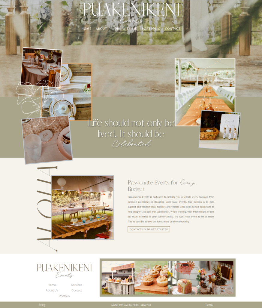
So, whether you’re opting for the quick route to DIY your website on a budget or delving into creative exploration, your branding choices make your website uniquely yours.
Step 5: Craft Captivating Content
My Struggle with Blank Page Syndrome: Unleash Your Inner Wordsmith
Crafting captivating content can feel like staring at a blank canvas. Here’s how to overcome that hurdle and make your website’s words come alive.
The Art of Writing Impactful Headlines: Grab Attention from the Get-Go
Your headlines are like virtual handshakes – they greet your visitors and set the tone. Keep them concise, intriguing, and benefit-driven. Some actionable tips:
- Be Clear: State the purpose of the page, and use bullet points to illustrate.
- Inject Emotion: Stir curiosity or excitement.
- Highlight Benefits: Explain how your visitors will gain value or reach their goals through your services.
- Highlight Value: Explain what your visitors can do with your services or products. What value do they get from it?
Visuals Speak Louder: Enhance with Engaging Images
Words are powerful, but visuals are attention magnets. Pair your content with high-quality images that align with your message. It’s a one-two punch that keeps visitors engaged.
AI-Generated Website Content: A Time-Saving Option
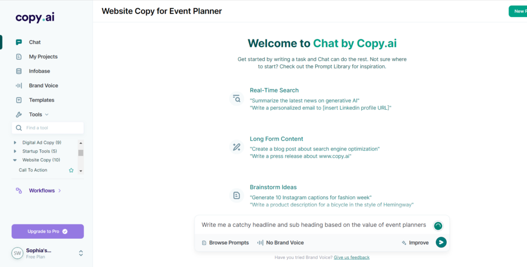
If you’re pressed for time, consider the marvel of AI-generated website content. Tools like these can provide you with a starting point, giving you ideas and inspiration. Remember, though, while AI can help, your personal touch and voice are what truly make your content resonate.
AI Copywriting tools:
Copy.ai
Canva (Magic Writing Tool)
Chat GPT
Your Unique Voice Makes All the Difference
When you DIY your website on a budget it is much easier to incorporate these tips to breathe life into your website’s content. Remember, it’s your website – your words, your story. Let your personality shine through every word, and you’ll create a website that truly connects with your audience.
Step 7: Mobile-Friendly and Secure
The “Oops, It Looks Awful on Mobile” Phase: Embrace Responsiveness
In the age of smartphones, a mobile-friendly website isn’t a luxury – it’s a necessity. Learn from my “oops” moment and ensure that your website looks and functions beautifully on all devices.
The Mobile-First Revolution: A Design Must
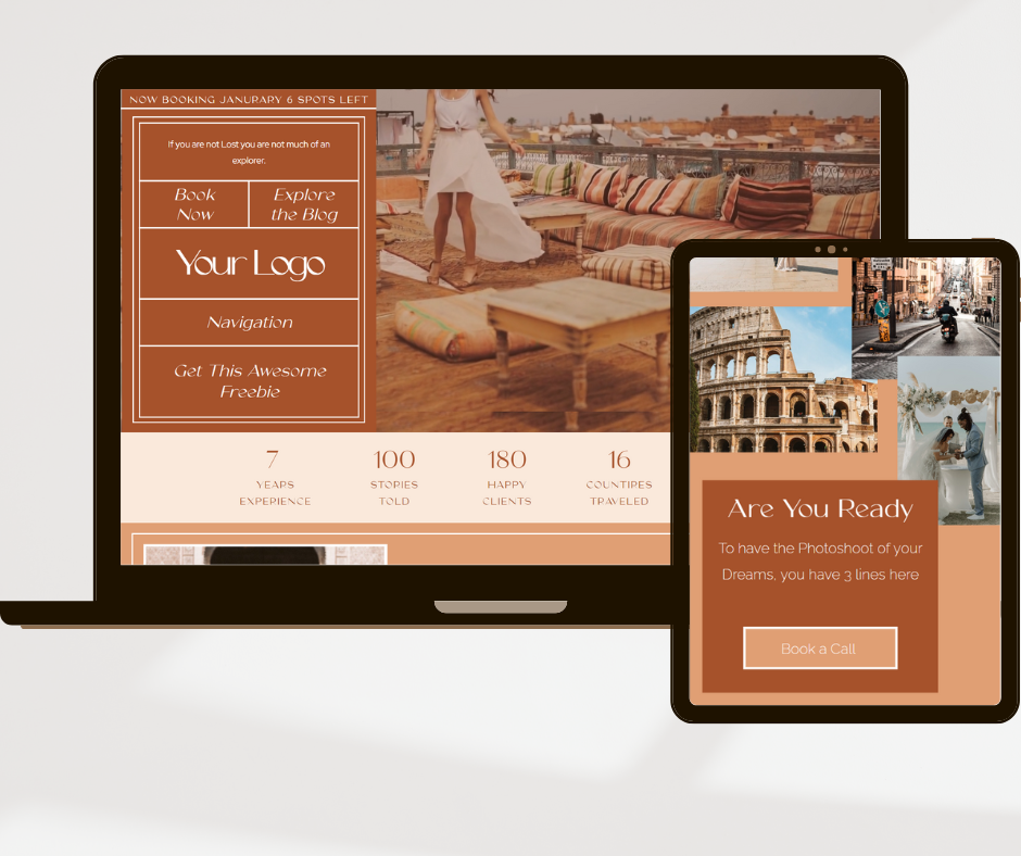
Responsive design ensures that your website adapts seamlessly to various screen sizes. Whether it’s a smartphone, tablet, or desktop, your content should be easily accessible and visually appealing. Test your website on different devices to guarantee a smooth user experience for everyone.
You can test a website design on tools like:
Responsive Test Tool
Responsive Design Checker
Defending Your Castle: Protect Your Website
Your website’s security is paramount. Just as you wouldn’t leave your physical store unlocked, you need to safeguard your digital space. Invest time in understanding basic security measures, such as using strong passwords, updating software, and implementing security plugins if you’re on a platform like WordPress.
Step 8: SEO for Small Business Success
Navigating the SEO Landscape: Elevate Your Online Visibility
Creating a budget-friendly website is just the beginning. Now, let’s ensure that your masterpiece gets noticed by the right audience. Search Engine Optimization (SEO) is your secret weapon to climb the search engine ranks and attract organic traffic.
Keyword Research: The Building Blocks of SEO
Start by identifying relevant keywords related to your business and industry. Tools like Google Keyword Planner or SEMrush can help you discover keywords that your target audience is searching for. These keywords will guide your content creation and optimization efforts.
Optimize Your Content: Make Google Your Friend
Incorporate your chosen keywords naturally into your content, including headings, subheadings, and body text. Craft informative and engaging meta titles and descriptions that accurately represent each page’s content.
Mobile-Friendly is SEO-Friendly: Google’s Mobile-First Index
Remember the mobile responsiveness we discussed earlier? It’s not just about user experience – Google rewards mobile-friendly websites with higher search rankings. Ensure that your site’s design and functionality are seamless across all devices.
Harness the Power of Backlinks: Quality over Quantity
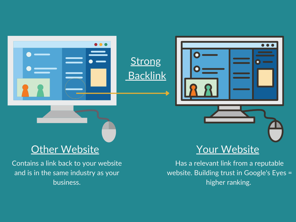
Backlinks – when other reputable websites link to your content – boost your site’s credibility in the eyes of search engines. Focus on acquiring high-quality backlinks from authoritative sources within your industry.
Conclusion: Your Budget-Friendly Website is Born!
Congratulations, intrepid DIYer! You’ve journeyed through the art of creating a budget-friendly website that packs a punch. From defining your purpose to crafting captivating content and ensuring mobile-friendliness and security, you’ve covered it all. Your website is your digital storefront, your business’s online home. Remember, it’s not just about the pixels on the screen; it’s about the story you tell and the impact you make. With these steps as your guide, go forth and conquer the digital realm with confidence!

View comments
+ Leave a comment