As a small business owner or entrepreneur, one of the most important aspects of your website is the call-to-action (CTA) design. Whether you want your visitors to sign up for a newsletter, buy a product, or book a consultation, an effective CTA can make all the difference in converting them into customers. But how do you create a CTA that really works? And can you do it without breaking the bank? The answer is yes! In this article, we’ll show you how to design effective CTA’s and provide Call to Action Examples you can add to your website today!
Table Of Contents
I. Importance of Call To Action Design
II. The Elements of a Powerful CTA
III. Call-to-Action Examples and Best Practices
IV. Implementing Effective CTAs on Your Website
V. Conclusion
VI. FAQs
Importance of Call-to-Action Design
CTAs are a crucial component of any website, as they encourage visitors to take action and become customers. They are designed to be eye-catching, clear, and persuasive, and can be used for a variety of purposes, such as signing up for a newsletter, downloading an ebook, or making a purchase. Effective CTAs can improve your conversion rate and help your business thrive online.
The Elements of a Powerful CTA
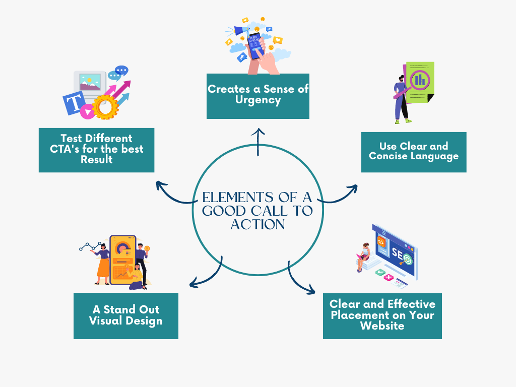
A powerful call-to-action (CTA) can make all the difference in converting your website visitors into customers. Here are some essential elements to include in your CTA:

- Clear and concise language: Use language that clearly communicates the action you want your visitors to take. Avoid ambiguity and keep the message short and to the point.
- Urgency: Create a sense of urgency to motivate your visitors to take action. Use phrases such as “limited time offer” or “act now” to encourage immediate action.
- Visual design: Use visual design to make your CTA stand out. Choose colors and fonts that complement your website design and make the CTA button visually appealing.
- Placement: Place your CTA in a prominent location on your website. Make sure it’s easily visible and stands out from the rest of the content.
- A/B testing: Test different versions of your CTA to see which one performs better. This will help you optimize your CTA and improve your conversion rate over time.
By incorporating these elements into your CTA design, you’ll create a more powerful and effective CTA that encourages visitors to take action on your website.
Call-to-Action Examples and Best Practices
When it comes to creating effective CTAs, there’s nothing like real-world examples to show what works and what doesn’t. Here are some best practices and examples of effective CTAs that can help guide you in creating your own:
- Be clear and specific: Use clear and specific language in your CTA to let visitors know exactly what action you want them to take. For example, “Sign up for our newsletter” or “Download our free ebook” are specific and easy to understand.
- You could also go the route of telling them what value they will receive in the call to action. I.E. “Get money-moving actionable tips right in your inbox.”
- A pro tip for a great call to action is to add a short statement about how easy the action takes. For example: “It only takes 2 minutes to sign up.” or “Our free consultation call is just a casual conversation to see if we are a good fit.”
- Create urgency: Use words like “now” or “today” to create a sense of urgency and motivate visitors to take action immediately. For example, “Get your free trial now” or “Limited time offer, act fast.”
- Use action-oriented verbs: Begin your CTA with an action verb to make it more compelling. Verbs like “get,” “start,” “join,” or “subscribe” can help visitors understand what they need to do.

Examples of effective Call to Actions include:
- “Start Your Free Trial Now” – from Netflix
- “Join Our Community” – from LinkedIn
- “Get a Free Consultation” – from a law firm
- “Receive a delicious dinner idea for tonight and every night!” – from a cooking blog
Implementing Effective CTAs on Your Website
Now that you’ve designed your effective CTA, it’s time to implement it on your website. Here are some tips to help you get started:
- Strategic Placement: Place your CTA in a visible location where it’s easy to find, such as near the top of the page or in a sidebar.
- Consistency: Make sure your CTA stands out and is consistent with your brand’s color scheme and overall design.
- Clarity: Use clear, concise language that communicates exactly what action you want your visitors to take.
- Multiple CTAs: Don’t be afraid to use multiple CTAs on a page, as long as they’re not competing with each other.
- Mobile Optimization: Make sure your CTA is optimized for mobile devices since more and more users are browsing the web on their phones.
Call to Action Examples:
- Amazon: Amazon’s “Buy Now” button is prominently displayed on product pages, making it easy for users to make a purchase.
- Uber: Uber’s CTA is a simple “Sign Up” button that’s visible on the homepage and throughout the app.
- Spotify: Spotify’s CTA is a green “Sign Up Free” button that stands out against the black background of their homepage.
Conclusion:
Effective CTAs are an essential component of any successful website. By following the best practices outlined in this article, you can create compelling and persuasive CTAs that will help you achieve your online goals, no matter what your budget may be. Remember to always test and optimize your CTAs to ensure they are performing at their best. With these tips and examples, you’ll be on your way to improving your website’s conversion rate and achieving success online.
Frequently Asked Questions:
How many CTAs should I have on my website?
- A: It depends on the purpose of your website and the content on each page. However, it’s generally recommended to have at least one CTA on every page, and more on pages where you want visitors to take a specific action.
What is the best color for a CTA button?
- A: The best color for your CTA button will depend on your website’s overall design and branding. However, studies have shown that bright, contrasting colors like orange, green, or blue tend to perform well.
How do I know if my CTAs are working?
- A: The best way to know if your CTAs are working is by tracking your website’s analytics and monitoring the conversion rate for each CTA. If you notice a low conversion rate, it may be time to try testing and optimizing your CTAs for better results.
View comments
+ Leave a comment